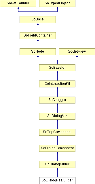
SoDialogRealSlider Class Reference
[Dialog]
 Dialog real slider node.
More...
#include <DialogViz/dialog/SoDialogRealSlider.h>

Public Member Functions | |
| SoDialogRealSlider () | |
| void | addAuditor (SoDialogRealSliderAuditor *auditor) |
| void | removeAuditor (SoDialogRealSliderAuditor *auditor) |
Public Attributes | |
| SoSFFloat | min |
| SoSFFloat | max |
| SoSFFloat | value |
Detailed Description
 Dialog real slider node.
This node creates a slider component for the dialog. Values of the slider are floating-point numbers.

The min field specifies the minimum possible value for the slider. The max field specifies the maximum possible value for the slider. The value field is the current value specifying the slider cursor position.
You can change the parts in any instance of this slider component using setPart(). The default part geometries are defined as resources for this SoDialogSlider class. They are detailed below in the Catalog Parts section of the online reference page for this class. You can make your program use different default resources for the parts by copying the file $OIVHOME/data/DialogViz/Skins/default/DialogSlider.iv into your own directory, editing the file, and then setting the environment variable DIALOGVIZ_SKINS_DIR to be a path to that directory, or by using the setSkinDirectory() method in your application.
FILE FORMAT/DEFAULT
- DialogRealSlider {
| min | 0.0 |
| max | 1.0 |
| value | 0.0 |
| format | "%.3f" |
| // fields from SoDialogSlider | |
| valueVisible | TRUE |
| continuousTrigger | FALSE |
| toggleVisible | TRUE |
| fixedLimits | FALSE |
| colors | [] |
| shadedColors | TRUE |
| // fields from SoDialogComponent | |
| width | 0 |
| height | 0 |
| fixedWidth | FALSE |
| fixedHeight | FALSE |
| minWidth | 0 |
| maxWidth | 0 |
| minHeight | 0 |
| maxHeight | 0 |
| margin | 0 |
| edgeStyle | NONE |
| labelVisibility | TRUE |
| // fields from SoDialogViz | |
| enable | TRUE |
| label | "" |
| labelAlignment | RIGHT |
| auditorID | "" |
CATALOG PARTS
-
SoDialogRealSlider {
Switch edgeStyleSwitch (from SoDialogComponent) {
Specify the appearance of the component border. By default, the component has its edgeStyle set to NONE.
Group edgeStyleNone (from SoDialogComponent)
Defines the appearance of the component when edgeStyle field is set to NONE.
Group edgeStyleShadowIn (from SoDialogComponent)
Defines the appearance of the component when edgeStyle field is set to SHADOW_IN.
Group edgeStyleShadowOut (from SoDialogComponent)
Defines the appearance of the component when edgeStyle field is set to SHADOW_OUT.
}
Group labelProp (from SoDialogSlider)
Specifies properties to apply to the text node that represents the label field value.
Switch checkSwtch (from SoDialogSlider) {
Specify the slider toggle button geometry.
Group checkStateOff (from SoDialogSlider)
Defines the toggle button geometry when the its value is set to FALSE.
Group checkStateOn (from SoDialogSlider)
Defines the toggle button geometry when the its value is set to TRUE.
}
Group frame (from SoDialogSlider)
Defines the slider main frame geometry.
Group cursor (from SoDialogSlider)
Defines the cursor geometry. Default size is set by DialogViz to (10, 10, z)
Switch edtFrmSwtch (from SoDialogSlider) {
Group valueFrame (from SoDialogSlider)
Defines the geometry of the edit zone when the text is not being modified.
Group editValueFrame (from SoDialogSlider)
Defines the geometry of the edit when the user is being modified.
}
Group editTextProp (from SoDialogSlider)
Specifies properties to apply to the text node that represents the value field.
}
Extra information for parts from above structure
SEE ALSO
SoDialogSlider, SoDialogCheckBox, SoDialogCheckBoxLauncher, SoDialogComboBox, SoDialogRadioButtons, SoDialogCustom, SoDialogEditText, SoColumnDialog, SoRowDialog, SoTabDialog, SoDialogLabel, SoDialogPushButton, SoDialogPushButtonLauncher, SoDialogSeparator, SoDialogIntegerSlider
- See related examples:
Constructor & Destructor Documentation
| SoDialogRealSlider::SoDialogRealSlider | ( | ) |
Constructor.
Member Function Documentation
| void SoDialogRealSlider::addAuditor | ( | SoDialogRealSliderAuditor * | auditor | ) |
Adds a dialogRealSliderAuditor to the current slider component.
| void SoDialogRealSlider::removeAuditor | ( | SoDialogRealSliderAuditor * | auditor | ) |
Removes the specified realSliderAuditor from the auditor list.
Member Data Documentation
Maximum value.
Default is 1.0.
Minimum value.
Default is 0.0.
Current value.
Default is 0.0.
The documentation for this class was generated from the following file:
- DialogViz/dialog/SoDialogRealSlider.h