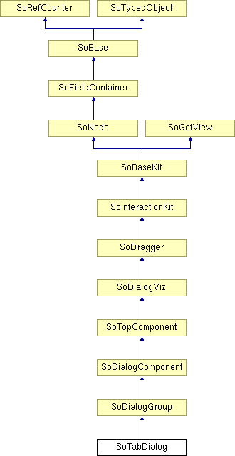
SoTabDialog Class Reference
[Dialog]
 Class that creates the dialog tab container.
More...
#include <DialogViz/dialog/SoTabDialog.h>

Public Types | |
| enum | TabsLocation { TOP, BOTTOM, LEFT, RIGHT } |
Public Member Functions | |
| SoTabDialog () | |
| void | addAuditor (SoTabDialogAuditor *auditor) |
| void | removeAuditor (SoTabDialogAuditor *auditor) |
Public Attributes | |
| SoSFEnum | tabsLocation |
| SoSFInt32 | selectedPage |
Detailed Description
 Class that creates the dialog tab container.
An SoTabDialog creates multiple pages for the same area of a window. Each page consists of a set of SoDialogComponents that the application displays when the user selects the corresponding tab. You can add, insert, and remove dialog components (SoDialogComponent) by using the addChild(), insertChild(), and removeChild() methods.
You can change the parts in any instance of this tab dialog component using setPart(). The default part geometries are defined as resources for this SoTabDialog class. They are detailed below in the Catalog Parts section of the online reference page for this class. You can make your program use different default resources for the parts by copying the file $OIVHOME/data/DialogViz/Skins/default/TabDialog.iv into your own directory, editing the file, and then setting the environment variable DIALOGVIZ_SKINS_DIR to be a path to that directory, or by using the setSkinDirectory() method in your application.
FILE FORMAT/DEFAULT
- TabDialog {
| tabsLocation | TOP |
| selectedPage | 0 |
| // fields from SoDialogGroup | |
| verticalScrollBar | TRUE |
| horizontalScrollBar | TRUE |
| scrollPolicy | AUTO |
| windowResizedByChildren | TRUE |
| // fields from SoDialogComponent | |
| width | 0 |
| height | 0 |
| fixedWidth | FALSE |
| fixedHeight | FALSE |
| minWidth | 0 |
| maxWidth | 0 |
| minHeight | 0 |
| maxHeight | 0 |
| margin | 0 |
| edgeStyle | NONE |
| labelVisibility | TRUE |
| // fields from SoDialogViz | |
| enable | TRUE |
| label | "" |
| labelAlignment | RIGHT |
| auditorID | "" |
CATALOG PARTS
-
SoTabDialog {
Switch edgeStyleSwitch (from SoDialogComponent) {
Specify the appearance of the component border. By default, the component has its edgeStyle set to NONE.
Group edgeStyleNone (from SoDialogComponent)
Defines the appearance of the component when edgeStyle field is set to NONE.
Group edgeStyleShadowIn (from SoDialogComponent)
Defines the appearance of the component when edgeStyle field is set to SHADOW_IN.
Group edgeStyleShadowOut (from SoDialogComponent)
Defines the appearance of the component when edgeStyle field is set to SHADOW_OUT.
}
Separator pagesSep {
Defines all tabs of the SoTabDialog component. Each tabs have the same geometry and structure defined by following parts:
Switch pageSwitch {
Defines the traversed geometry relatively to user action.
Group unselected
Defines the geometry of the tab page if it is not selected
Group selected
Defines the geometry of the tab page if it is selected
}
Group textProp
Specifies properties to apply to the text node that represents the label of the page.
...
Ref pageSwitch
Ref textProp
}
Switch lButtonSwtch {
Defines the traversed geometry relatively to user action. Defines the geometry of the move left button. Default size is set to (14, 14, z).
Group lButtonReleased
Geometry when button is released.
Group lButtonPressed
Geometry when button is pressed.
}
Switch rButtonSwtch {
Defines the traversed geometry relatively to user action. Defines the geometry of the move roght button. Default size is set to (14, 14, z).
Group rButtonReleased
Geometry when button is released.
Group rButtonPressed
Geometry when button is pressed.
}
Group frame
Defines geometry of the main tab dialog frame.
}
Extra information for parts from above structure
SEE ALSO
SoColumnDialog, SoRowDialog, SoDialogGroup
- See related examples:
Member Enumeration Documentation
- Enumerator:
Constructor & Destructor Documentation
| SoTabDialog::SoTabDialog | ( | ) |
Constructor.
Member Function Documentation
| void SoTabDialog::addAuditor | ( | SoTabDialogAuditor * | auditor | ) |
Adds a TabDialogAuditor to current TabDialog component.
| void SoTabDialog::removeAuditor | ( | SoTabDialogAuditor * | auditor | ) |
Removes the specified TabDialogAuditor from the auditor list.
Member Data Documentation
Specifies currently selected tab page.
Default is zero, the first page.
Specifies location of the tabs.
Default value is TOP.
The documentation for this class was generated from the following file:
- DialogViz/dialog/SoTabDialog.h