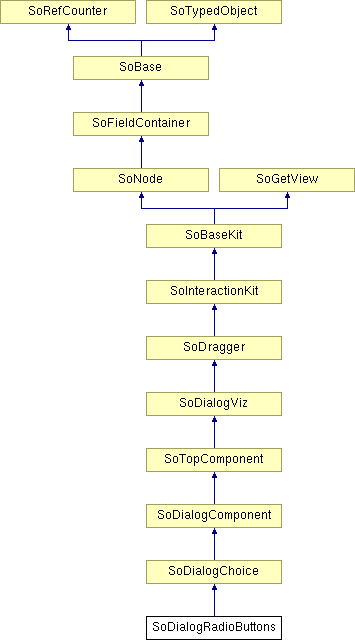
SoDialogRadioButtons Class Reference
[Dialog]
 Dialog radio buttons node.
More...
#include <DialogViz/dialog/SoDialogRadioButtons.h>

Public Member Functions | |
| SoDialogRadioButtons () | |
Detailed Description
 Dialog radio buttons node.
This node defines radio buttons as a one-dialog component.

This component does not support \n (newline) characters in its fields.
|
You can change the parts in any instance of this radio button component using setPart(). The default part geometries are defined as resources for this SoDialogRadioButtons class. They are detailed below in the Catalog Parts section of the online reference page for this class. You can make your program use different default resources for the parts by copying the file $OIVHOME/data/DialogViz/Skins/default/DialogRadioButtons.iv into your own directory, editing the file, and then setting the environment variable DIALOGVIZ_SKINS_DIR to be a path to that directory, or by using the setSkinDirectory() method in your application.
FILE FORMAT/DEFAULT
- DialogRadioButtons {
| // fields from SoDialogChoice | |
| items | [] |
| selectedItem | 0 |
| // fields from SoDialogComponent | |
| width | 0 |
| height | 0 |
| fixedWidth | FALSE |
| fixedHeight | FALSE |
| minWidth | 0 |
| maxWidth | 0 |
| minHeight | 0 |
| maxHeight | 0 |
| margin | 0 |
| edgeStyle | NONE |
| labelVisibility | TRUE |
| // fields from SoDialogViz | |
| enable | TRUE |
| label | "" |
| labelAlignment | RIGHT |
| auditorID | "" |
CATALOG PARTS
-
SoDialogRadioButtons {
Switch edgeStyleSwitch (from SoDialogComponent) {
Specify the appearance of the component border. By default, the component has its edgeStyle set to NONE.
Group edgeStyleNone (from SoDialogComponent)
Defines the appearance of the component when edgeStyle field is set to NONE.
Group edgeStyleShadowIn (from SoDialogComponent)
Defines the appearance of the component when edgeStyle field is set to SHADOW_IN.
Group edgeStyleShadowOut (from SoDialogComponent)
Defines the appearance of the component when edgeStyle field is set to SHADOW_OUT.
}
Group frame
Defines the geometry of the label frame.
Group labelProp
Specifies properties to apply to the text node that represents the label field value.
Separator itemsSep {
Each item has the same geometry and structure, defined by the following parts:
Group ItemFrame
Defines the geometry of an item frame
Switch itemBtnSwtch{
Specify item state.
Group stateOff
Defines the items geometry when the items correspond to the unselected item.
Group stateOn
Defines the item geometry when the item correspond to the selected item.
}
Group itemTextProp
Specifies properties to apply to the text nodes that represents the items field values.
...
Ref ItemFrame
Ref itemBtnSwtch
Ref itemTextProp
}
}
Extra information for parts from above structure
SEE ALSO
SoDialogCheckBox, SoDialogCheckBoxLauncher, SoDialogComboBox, SoDialogCustom, SoDialogEditText, SoColumnDialog, SoRowDialog, SoTabDialog, SoDialogLabel, SoDialogPushButton, SoDialogPushButtonLauncher, SoDialogSeparator, SoDialogIntegerSlider, SoDialogRealSlider
- See related examples:
Constructor & Destructor Documentation
| SoDialogRadioButtons::SoDialogRadioButtons | ( | ) |
Constructor.
The documentation for this class was generated from the following file:
- DialogViz/dialog/SoDialogRadioButtons.h


