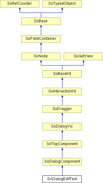
SoDialogEditText Class Reference
[Dialog]
 Dialog EditText node.
More...
#include <DialogViz/dialog/SoDialogEditText.h>

Public Member Functions | |
| SoDialogEditText () | |
| void | addAuditor (SoDialogEditTextAuditor *auditor) |
| void | removeAuditor (SoDialogEditTextAuditor *auditor) |
Public Attributes | |
| SoSFString | editText |
| SoSFBool | editable |
| SoSFBool | multiLine |
| SoSFBool | wrapLine |
| SoSFBool | trigOnEnter |
| SoSFBool | isNumeric |
Detailed Description
 Dialog EditText node.
This node defines a multi-line editing zone for the dialog.

The editText field represents the text of the editing zone. This field supports the newline (\n) character and the tabulation character (\t). The editable field specifies if the user can write new text in the edit zone or not. The multiLine field allows to edit a multiLine text. In this case, a vertical scroll bar appears at the left side of the component. On windows system, mouse scroll wheel is supported in the edit area. The trigOnEnter field specifies how the associated auditor is triggered. If its value is TRUE, the event happened only when the <ENTER> key is pressed. Otherwise, the auditor is called each time the edit text changes. It's possible to filter text to be numeric or not by using the isNumeric field.
Note : On UNIX systems, the auditor call is depending on the multiLine field value. If the edit control is multiLine, only the num pad <ENTER> key will process the auditor, else, in case multiLine is FALSE, the two <ENTER> key will do it.
To add or remove an SoDialogEditTextAuditor, use the addAuditor() and removeAuditor() methods.
You can change the parts in any instance of this editText component using setPart(). The default part geometries are defined as resources for this SoDialogEditText class. They are detailed below in the Catalog Parts section of the online reference page for this class. You can make your program use different default resources for the parts by copying the file $OIVHOME/data/DialogViz/Skins/default/DialogEditText.iv into your own directory, editing the file, and then setting the environment variable DIALOGVIZ_SKINS_DIR to be a path to that directory, or by using the setSkinDirectory() method in your application.
FILE FORMAT/DEFAULT
- DialogEditText {
| editText | "" |
| editable | TRUE |
| trigOnEnter | TRUE |
| isNumeric | FALSE |
| multiLine | FALSE |
| wrapLine | TRUE |
| // fields from SoDialogComponent | |
| width | 0 |
| height | 0 |
| fixedWidth | FALSE |
| fixedHeight | FALSE |
| minWidth | 0 |
| maxWidth | 0 |
| minHeight | 0 |
| maxHeight | 0 |
| margin | 0 |
| edgeStyle | NONE |
| labelVisibility | TRUE |
| // fields from SoDialogViz | |
| enable | TRUE |
| label | "" |
| labelAlignment | RIGHT |
| auditorID | "" |
CATALOG PARTS
-
SoDialogEditText {
Switch edgeStyleSwitch (from SoDialogComponent) {
Specify the appearance of the component border. By default, the component has its edgeStyle set to NONE.
Group edgeStyleNone (from SoDialogComponent)
Defines the appearance of the component when edgeStyle field is set to NONE.
Group edgeStyleShadowIn (from SoDialogComponent)
Defines the appearance of the component when edgeStyle field is set to SHADOW_IN.
Group edgeStyleShadowOut (from SoDialogComponent)
Defines the appearance of the component when edgeStyle field is set to SHADOW_OUT.
}
Group labelProp
Specifies properties to apply to the text node that represents the label field.
Switch downSwitch {
Defines the traversed geometry relatively to the down scroll button state
Group downReleased
Defines the geometry of the down scroll button when it is in its released state. Default size is set by DialogViz to (14, 14, 1).
Group downPressed
Defines the geometry of the down scroll button when it is in its pressed state. Default size is set by DialogViz to (14, 14, 1).
}
Switch upSwitch {
Defines the traversed geometry relatively to the up scroll button state
Group upReleased
Defines the geometry of the up scroll button when it is in its released state. Default size is set by DialogViz to (14, 14, z).
Group upPressed
Defines the geometry of the up scroll button when it is in its pressed state. Default size is set by DialogViz to (14, 14, z).
}
Group scrollFrame
Defines the scroll back frame geometry.
Group cursorFrame
Defines the scroll cursor geometry. Default size is set by DialogViz to (14, y, z).
Switch frameSwitch {
Defines the traversed geometry relatively to user action.
Group frame
Defines the geometry of the edit zone when the text is not being modified.
Group editFrame
Defines the geometry of the edit when the user is being modified.
}
Group textProp
Specifies properties to apply to the text node that represents the editText field value.
}
Extra information for parts from above structure
SEE ALSO
SoDialogCheckBox, SoDialogCheckBoxLauncher, SoDialogComboBox, SoDialogRadioButtons, SoDialogCustom, SoColumnDialog, SoRowDialog, SoTabDialog, SoDialogLabel, SoDialogPushButton, SoDialogPushButtonLauncher, SoDialogSeparator, SoDialogIntegerSlider, SoDialogRealSlider
- See related examples:
Constructor & Destructor Documentation
| SoDialogEditText::SoDialogEditText | ( | ) |
Constructor.
Member Function Documentation
| void SoDialogEditText::addAuditor | ( | SoDialogEditTextAuditor * | auditor | ) |
Adds a dialogEditTextAuditor to the current editText component.
| void SoDialogEditText::removeAuditor | ( | SoDialogEditTextAuditor * | auditor | ) |
Removes the specified editTextAuditor from the auditor list.
Member Data Documentation
Allows writing in the edit zone.
Default is TRUE.
String of the edit zone.
Default value is an empty string.
Specifies if typed text is numeric only.
Sets multi-line mode.
Default is FALSE.
When trigOnEnter is TRUE, the associated auditor is called only when the <ENTER> key is pressed.
Otherwise, the auditor is called at any edit text changes. Default is TRUE.
Sets wraping line mode.
Default is TRUE.
The documentation for this class was generated from the following file:
- DialogViz/dialog/SoDialogEditText.h